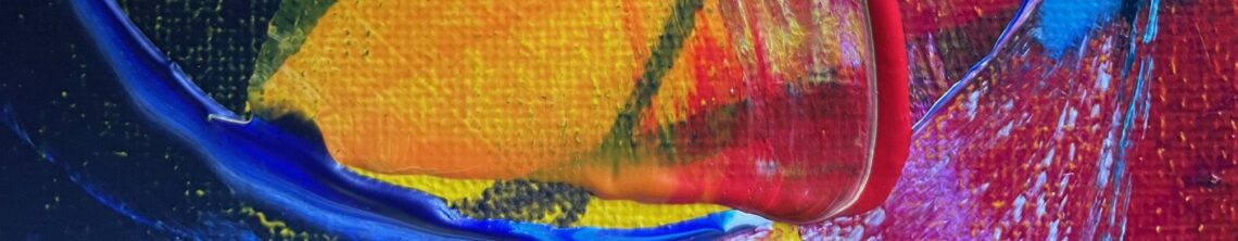
Mixing a dark moody grey from ultramarine blue, red, yellow and white acrylics only; it’s not as easy as it looks.

Expressive, abstract mixed media art by Rachel James
Mixing a dark moody grey from ultramarine blue, red, yellow and white acrylics only; it’s not as easy as it looks.

Who doesn’t love purple and blue pansies? The rich colours and velvety texture; nature is wonderful. I love how this has come together. I did a lot of work studying the distinctive foliage ‘clusters’ and feel happy with the form and how the leaves have blended into the inky, textured background to give depth. The colours are so fresh and bright.

Friday’s collaging. I am busy working on an Autumn collection of painting featuring roses from my garden.

All ready to get straight into it, for three hours of preschool tomorrow.

Lavender IV is a composition study from Lavender I, an area of the painting I particularly liked and wanted to work into a small-size abstract painting on handcut board.

Lavender III describes a scene from the front of the Old School House, the railings and flowering lavender hedge create a strong line and perspective, drawing you into the scene. The colours are vibrant purple, lilac, green, lime and turquoise.

Lavender II is a experiment with abstract and scale. The marks describe the lines and movement of the lavender hedge which fronts the Old School House. Deep blue, purple and lilac flowing across blues, greens and pops of lime green. It is painted on a large, deep edge canvas.

I continue to paint when I can, I’m currently immersed in purples and the scent of lavender. I’m experimenting with scale, colour combinations and printed collage papers. I’ve been reading about surface pattern design, which is where I began at art college at sixteen-years-old, and it seems to be inadvertently having an influence on the painting compositions. I’m having fun! Here is a little peak at the work in progress.

Sunflowers II is another sizzling juxtaposition of cool and warm colours inspired by a favourite summer bloom. This piece was an experiment with a smaller composition.

Strawberry Flowers was inspired by the fresh spring garden at Old School House Art; the excitement of seeing strawberry flowers popping out and anticipating the juicy red berries to come. The colour palette is a cool, fresh and zingy green, white and yellow with a little added sparkle.

Apple Blossom II is the second in the series, inspired by the apple tree blossom at Old School House Art contrasted against the glorious blue spring sky. The calming colours are cool and harmonious layers of blues, purples, pinks and whites. It was bought for a lilac bedroom wall. Possibly my best yet!

The Apple Blossom series have been many years inside my head; inspired by a particular view of the apple tree blossom at Old School House Art contrasted against the glorious blue spring sky. A really successful change of scale for me. The colours are cool and harmonious layers of blues, purples and whites, with a shock of yellow

This painting was inspired by the early spring garden at Old School House Art; that first peek of colour indicating spring is around the corner. The colour palette is a sizzling juxtaposition of cool blues and purples and warm oranges and pinks.

I’m working on two paintings inspired by the garden’s bluebells.