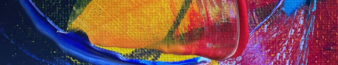
I began this painting with expressive charcoal marks, moving quickly and instinctively. I mixed the paints and got started, I had a rough idea of how I wanted to start the brush marks but then it moves beyond that and it takes on its own energy.

Expressive, abstract mixed media art by Rachel James
I began this painting with expressive charcoal marks, moving quickly and instinctively. I mixed the paints and got started, I had a rough idea of how I wanted to start the brush marks but then it moves beyond that and it takes on its own energy.

This mini painting began with loose charcoal marks. I used wide paintbrushes to be as expressive and free as possible.

Today I sent out an email update on how my recent work is developing. If you would like to receive it too, please join my Art Supporters mailing list.

I created this painting in September when the rose bush was in full bloom. I tried a new technique, dribbling ink across the canvas to create a web of rose stems, which looks very ‘climbing’ rose. I really like the end result, it has a dark, gothic feel.

This was an exciting experiment in discordant colours, which are colour combinations that contrast, clash, or “fight” rather than harmonize. Yep, got that! I also wanted it to be a simple multi-directional composition. I used painted newsprint for the stems which is surprisingly difficult to control. I love the unexpected result.

Who doesn’t love purple and blue pansies? The rich colours and velvety texture; nature is wonderful. I love how this has come together. I did a lot of work studying the distinctive foliage ‘clusters’ and feel happy with the form and how the leaves have blended into the inky, textured background to give depth. The colours are so fresh and bright.

I’d been exploring darker, moody, Autumn colours and I really needed a blast of rainbow colours. I have created three paintings inspired by the winter pansies planted in my gravel pot garden which have flowered throughout the change of seasons.

I love this all-over-design on handcut board featuring cream roses; the composition is influenced by my past life as a textile design student. I enjoy reusing and recycling materials and incorporating everyday life into my paintings; I printed these rose stems with Amazon packaging. Great texture!

This is the second of three paintings inspired by the winter pansies planted in my gravel pot garden which are brightening up Autumn.

Lavender I was inspired by the lavender hedge I planted along the old school railings fronting the house; the smell is divine and the bees adore it. I experimented with different backgrounds with this series. Lavender I is harmonious pinks and purples with unexpected pops of lime green.

I continue to paint when I can, I’m currently immersed in purples and the scent of lavender. I’m experimenting with scale, colour combinations and printed collage papers. I’ve been reading about surface pattern design, which is where I began at art college at sixteen-years-old, and it seems to be inadvertently having an influence on the painting compositions. I’m having fun! Here is a little peak at the work in progress.

Sunflowers II is another sizzling juxtaposition of cool and warm colours inspired by a favourite summer bloom. This piece was an experiment with a smaller composition.

Friday afternoon’s collaging; the sunflowers are growing. Children’s story Handa’s Surprise by Eileen Browne (2yo’s book of the moment) is influencing the colours in this painting. I love!

Strawberry Flowers was inspired by the fresh spring garden at Old School House Art; the excitement of seeing strawberry flowers popping out and anticipating the juicy red berries to come. The colour palette is a cool, fresh and zingy green, white and yellow with a little added sparkle.

Apple Blossom II is the second in the series, inspired by the apple tree blossom at Old School House Art contrasted against the glorious blue spring sky. The calming colours are cool and harmonious layers of blues, purples, pinks and whites. It was bought for a lilac bedroom wall. Possibly my best yet!

The Apple Blossom series have been many years inside my head; inspired by a particular view of the apple tree blossom at Old School House Art contrasted against the glorious blue spring sky. A really successful change of scale for me. The colours are cool and harmonious layers of blues, purples and whites, with a shock of yellow

This painting incorporates a loose drawing style I often come back to and the colour palette is literally a rainbow of colour!

The photograph of this painting was taken in the garden, spot the confused bee!

This painting means so much to me. A truly wonderful weekend workshop away from the family chaos immersing myself in all things acrylic mixed media at The Old School in Whittlesford (I know, the name, it was synchronicity!) with Valerie Pettifer. This one hangs proudly in the entrance of our Old School House.